Barroca - Love St. Studio


A imagem gráfica do novo Museu da Barroca surge pelas mãos de Joana e Carmo, designers e fundadoras da Love Street Studio. Criada em 2010, após uma passagem por Barcelona, as duas amigas e colegas de universidade aventuram-se neste projeto determinadas em quebrar a tendência das grandes agências em Portugal. Passados 6 anos e sempre motivadas pela vontade de desenvolver trabalhos mais personalizados e especiais, contam no seu portfólio com clientes como a Sony Music, Ordem dos Arquitectos e Cantê Lx.
Esta não é a primeira vez que Joana e Carmo estão envolvidas em iniciativas na área do design de exposição. Depois de Tanto Mar, onde exploram objetos comuns que cruzam fronteiras, surge a oportunidade não só de criar a imagem gráfica do Museu da Barroca, mas também muito do material de comunicação da exposição. Esta segunda experiência despertou nas designers uma enorme vontade de dedicar mais tempo a desafios desta natureza.
The graphic identity of the new Museu da Barroca was created by Joana and Carmo, designers and founders of the Love Street Studio. Founded in 2010, short after an adventure in Barcelona, the two friends and university colleagues ventured in this project determined to escape from the trends of the large Portuguese agencies. Six years have gone by but they are still motivated by the desire to create special and customised projects. The Love St. portfolio includes clients like Sony Music, Ordem dos Arquitectos and Cantê Lx.
This is not the first time that Joana and Carmo are involved in projects of this nature. After Tanto Mar, where they explored crossing borders with common objects, here they had the opportunity not only to create the museum’s graphic image but much of the exhibition’s communication material as well. This second experience related to exhibition design gave rise to a strong desire: to devote more time to challenges like this one.


Joana e Carmo explicam-nos as ideias por detrás deste trabalho e como o alicerce e ponto de partida para a criação da imagem do Museu da Barroca foi sempre o edifício que o acolhe.
A estrutura da cobertura do edifício assume um papel determinante na criação do logótipo. Falem-nos um pouco sobre este cruzamento entre a arquitetura do novo museu e a sua imagem gráfica.
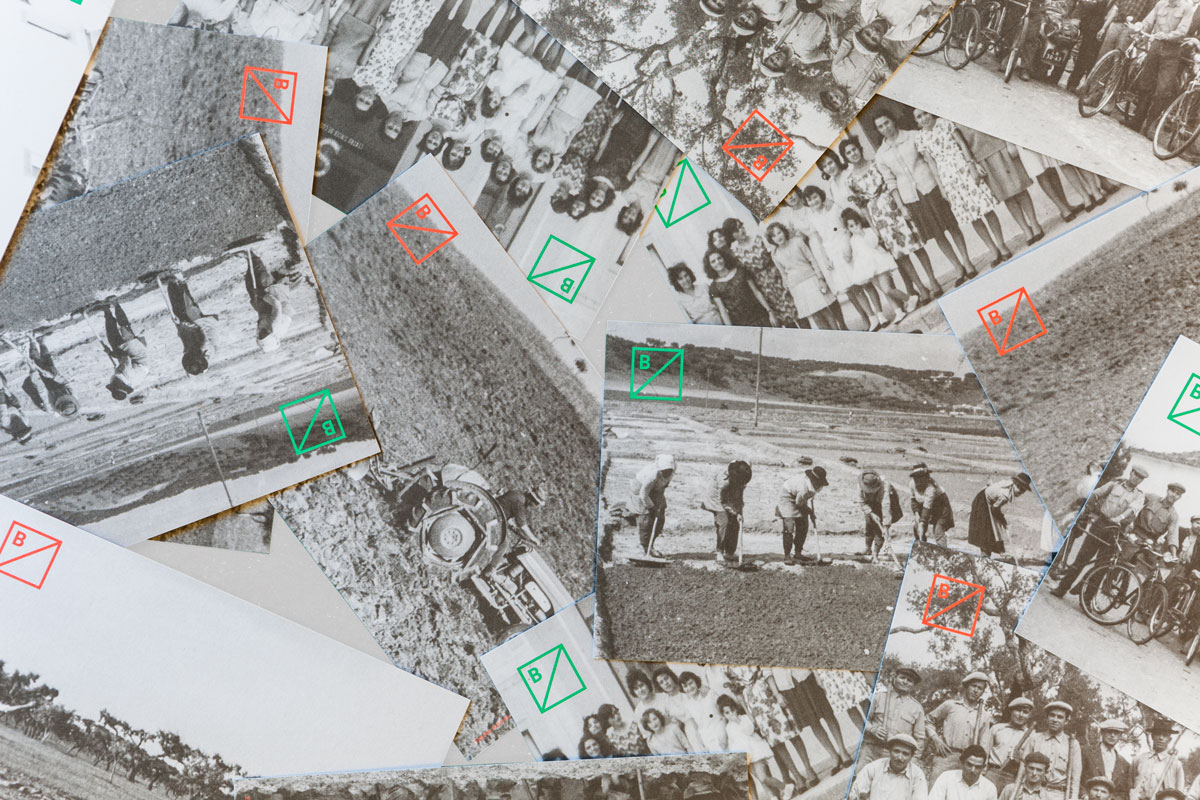
Uma vez que o núcleo tem o nome da herdade – Barroca – achámos determinante que o logótipo refletisse alguma característica dos elementos que o define. Por esta razão optámos por utilizar a estrutura do teto para criar uma grelha modular que acaba por dar forma ao próprio logótipo.
Joana and Carmo explained to us their ideas behind this project and how important was the structure of the building accommodating the museum to the creative process of the new image.
The roof structure of the building has a key role in creating the logo. Tell us about this intersection between the architecture of the new museum and its graphic image.
Because the museum shares the name of the property - Barroca - it was crucial for us to translate key elements of the building into the logo. Therefore we used the roof structure to create a modular grid which ultimately forms the logo itself.
De que modo foram tidas em conta as memórias e o passado que caracterizam esta região onde o edifício está inserido?
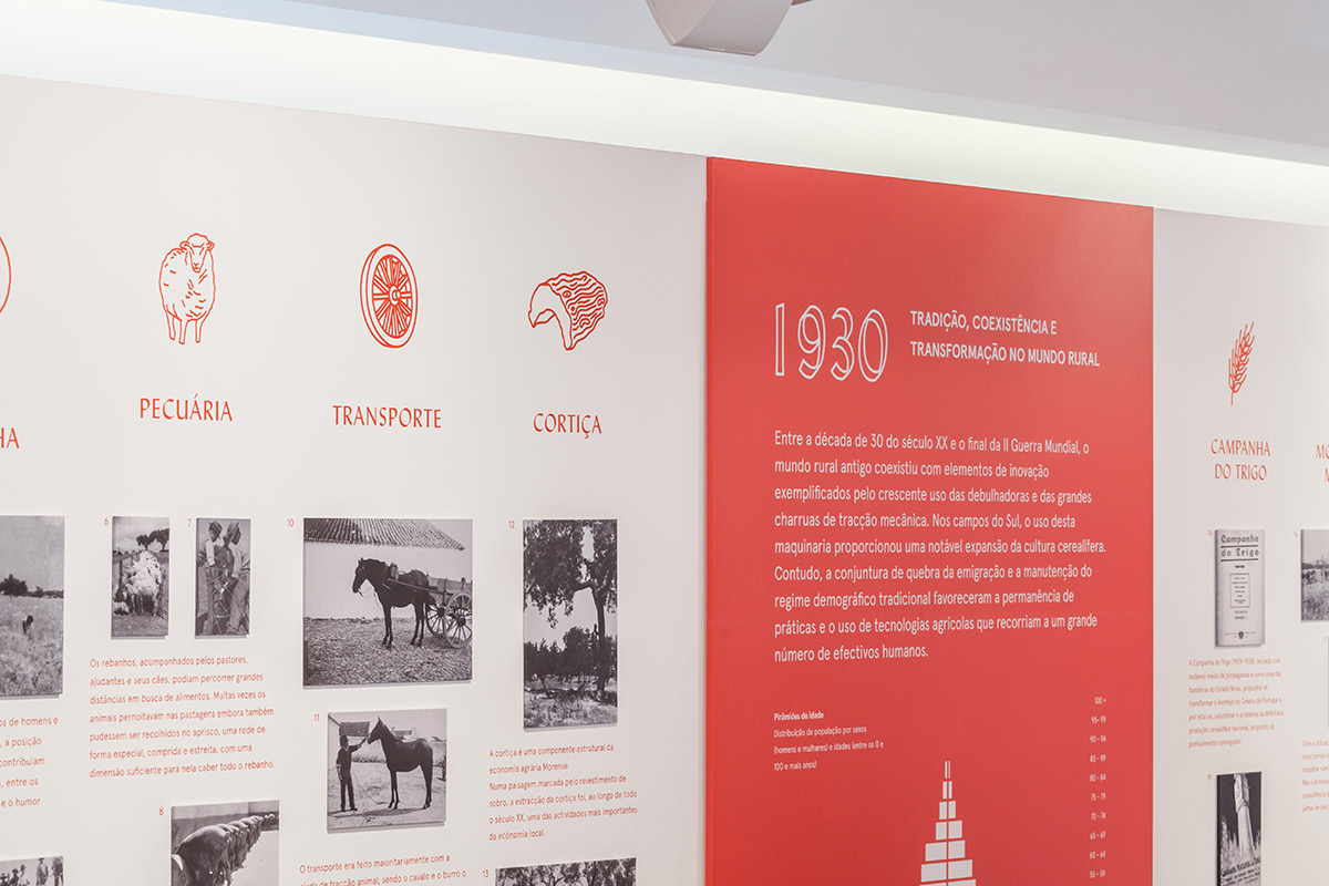
As memórias e o passado estão caracterizadas pela utilização de fotografias originais, e que fazem parte do património local, as ilustrações de traço rústico e a tipografia, remetem ao universo gráfico/ visual das décadas que são abordadas ao longo da exposição. Através destes recursos procurámos retratar o séc. XX na vila de Mora, fazendo a ligação entre o passado e o presente.
As escolhas tipográficas assumem um grande peso neste projeto. Podem revelar-nos qual o tipo de letra principal utilizado na construção do logótipo e restante material?
A tipografia escolhida para a identidade corporativa foi a Post Grotesk e para complementar os títulos da exposição e ligação às ilustrações, optámos por utilizar a Lydian. Tal como o conceito da identidade corporativa, funcionam em contraste uma com a outra.
Explain to us how Mora’s memories and the past were considered.
The memories and the past were represented by the use of original photographs - that are part of the local heritage - the engraving-style illustrations and the typography. All these elements portray Mora’s village during the twentieth century and lead to the visual universe of the decades on display. They are the link between the past and the present.
Typography has an important part in this project. Can you reveal us which type fonts were used?
The typography chosen for the corporate identity was the Post Grotesk. Lydian was then taken as a complement and used in the exhibition titles together with the illustrations. They work in contrast with each other like the concept developed for the museum’s identity.

Qual a relevância da linha diagonal representada no logótipo e que acompanha também a sinalética do museu?
Esta linha nasce da estrutura do teto. A linha diagonal que está presente não só no símbolo, como nas restantes peças, reflete o contraste entre as épocas, fazendo a ponte entre o passado e o presente, sendo a principal ideia comunicar a herança e o património entre as variadas gerações do concelho de Mora.
As cores escolhidas, verde e vermelho, remetem às cores do meio envolvente. Falem-nos um pouco sobre esta escolha.
A cor tem um papel determinante na identidade, atribuindo carácter e impacto ao projeto. Procurámos utilizar o contraste entre estas 2 cores fortes – verde e vermelho – que refletem os elementos essenciais do núcleo e da região: o campo envolvente, a cerâmica e os materiais do edifício.
Tell us about the diagonal line that we can find not only in the logo but also in the museum’s signage.
This line comes from the ceiling structure. The diagonal line shows the contrast between different periods in history, making the bridge between the past and the present. The main idea was to communicate the heritage and patrimony of Mora’s different generations.
The green and red colours mirror the surroundings. Tell us a little about this choice.
Colour has a crucial role throughout the identity bringing character and impact to the project. We tried to use the contrast between these two strong colours - green and red - both reflecting essential elements of the region: the surrounding landscape, the red clay ceramics and the materials present in the building.
Photo: Love St. Studio & Francisco Nogueira